
Fred Woodard
Fred Woodard is an influential magazine designer who specializes in personalized spreads that include heavy use of photography combined with typography. He uses large photos and often integrates type within the photos, or creates types out of non-traditional media such as subway tiles, alphabet soup, or rope. These decisions change based on the personality and attributes of the feature's subjects. He uses bold components to force the viewer's eye in a certain viewing order. His Rolling Stone features are highly influential in feature design. Today, Woodard works for GQ magazine.

Gail Anderson
Gail Anderson worked closely with Fred Woodard at Rolling Stone, creating bold, photographic features for rolling stone. She integrated illustrative elements often to add dimension and personality to her features. She often uses script type, ornate style and feminine accents to complement the photography. Today she is a professor of graphic arts at the School of Visual Arts as well as a partner at Anderson Newton design.
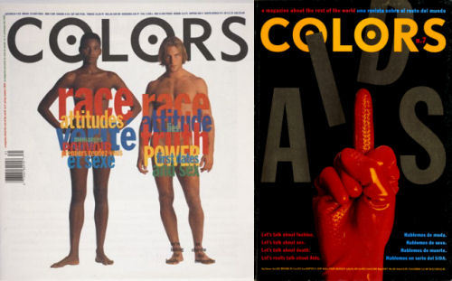
Tibor Kalman
Tibor Kalman defines good design as "unexpected and untried." His experimental designs lead the graphic design frontier in the 1980s, including provocative and taboo imagery combined with unconventional use of type. He focused consciously on the impact of his designs, striving to inspire action and promote change with his work. He founded Colors magazine in order to showcase his designs and more importantly, causes that resonated with him.

Alexy Brodovitch
The style of Harper's Bazaar from 1934-1958 can be attributed to the unprecedented designs of Alexey Brodovitch. Brodovitch's style was highly unconventional for the time. His unique design choices often involved aligning text to fit the content of photographs and simplistic emphasis on the photo's subjects against a white backdrop. Brodovitch worked often with photographer Richard Avedon. His influence is still prevalent in modern magazine design, as he was a pioneer of manipulating typography to become a striking visual element.
Neville Brody
The former director of Face and Arena magazines was also a director of art for record labels among other design ventures. He uses bold typography and grunge style, breaking all conventional type rules. He makes tight leading, type that turns corners, text that runs out of order, and other odd design choices that still make his work beautiful and, more importantly, legible.
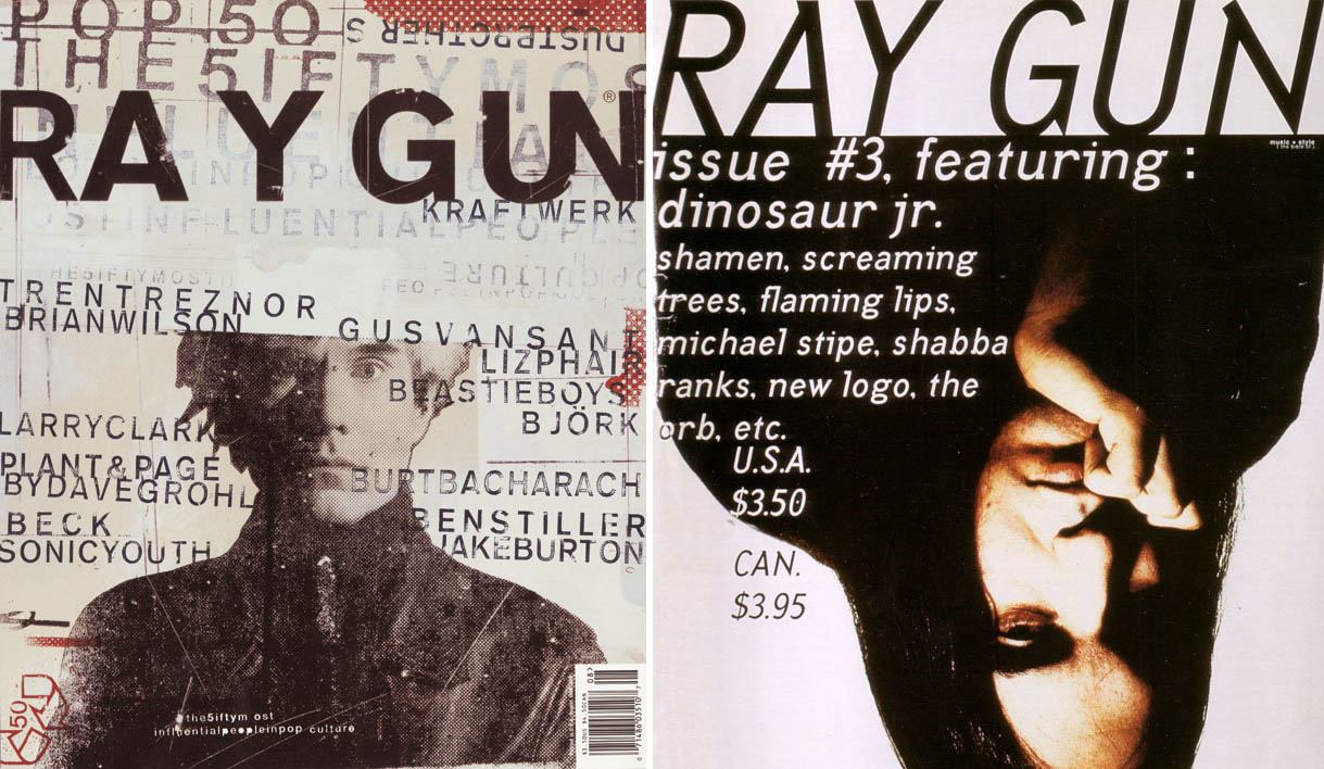
David Carson
The forefront of grunge style and a true pioneer of the style, David Carson uses highly irregular typography. He uses odd angles, uneven letter sizes, and designs that break the grid. He is the director of Raygun magazine.
No comments:
Post a Comment